[TOC]
In this tutorial, we're going to learn how to make a reusable pop-up modal component with Vue.js 3. We're going to use composition API which is a new feature in vue.js 3. We'll also use the transition component provided by Vue to apply the transition effect to the modal.
1. Project setup
We're going to create Vue project using Vite. Open your terminal and follow these steps.
npm init vite@latest
✔ Project name: … vue-modal
✔ Select a framework: › vue
✔ Select a variant: › vue

Scaffolding project in /Users/eding/Learn/Vue/vue-modal...

Done. Now run:

  cd vue-modal
  npm install
  npm run dev
Open vue-modal project in your editor. Remove unused files in src folder such as assets/logo.png, components/HelloWorld.vue.
Open App.vue and replace everything with this code
<template>
	<button>Show Modal</button>
</template>
2. Create base Modal component
Navigate to src/components folder, then create a new folder called modal. Inside that folder let's create a new file called Modal.vue, and put the following code.
<template>
    <div class="vue-modal">
        <div class="vue-modal-inner">
            <div class="vue-modal-content">
                <slot />
              	<button type="button" @click="$emit('close')">Close</button>
            </div>
        </div>
    </div>
</template>
Back to App component. Add <script> and inside that, we import and register the Modal component. In the template, we call the Modal component, and put a paragraph inside it.
<template>
  <button>Show Modal</button>

  <Modal>
    <p>
      Lorem ipsum dolor sit amet consectetur adipisicing elit. In repudiandae
      enim voluptas assumenda possimus deserunt quia autem debitis unde labore
      illo inventore ex minima voluptatibus porro perferendis, ipsa totam sint!
    </p>
  </Modal>
</template>

<script>
import Modal from "./components/modal/Modal.vue";

export default {
  components: { Modal }
};
</script>
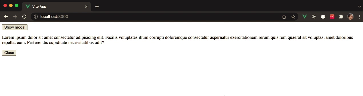
If we go to our browser, we'll see on the screen a button and a paragraph.
3. Show and hide the modal
In App component import ref from vue. Add setup method and inside that, we define a variable called isOpen with false. We return that variable so that it can be exposed in our template.
<script>
import { ref } from "vue";
// ...

export default {
  // ...
  setup() {
    const isOpen = ref(false);

    return { isOpen };
  },
};
</script>
Jump to the template of App component. We attach on the button a click event. In there we change the isOpen to true.
In the Modal component call we pass down the isOpen through open attribute and add click event handler. In there we change the isOpen with its opposite value.
<template>
  <button @click="isOpen = true">Show Modal</button>

  <Modal :open="isOpen" @close="isOpen = !isOpen">
    ...
  </Modal>
</template>
Back to Modal component. In this component, we define props called open. It's in the type of Boolean and it required.
Now in the template of Modal component, we can use v-show directive and pass the open to it.
<template>
  <div class="vue-modal" v-show="open">
      <transition name="slide">
        <div class="veu-modal-inner">
          <div class="vue-modal-content">
            <slot />
            <button type="button" @click="$emit('close')">Close</button>
          </div>
        </div>
      </transition>
    </div>
</template>

<script>
export default {
  props: {
    open: {
      type: Boolean,
      default: true,
    },
  },
};
</script>
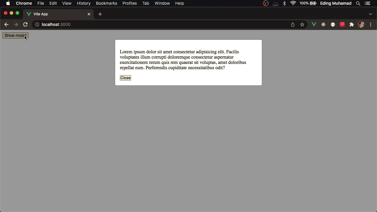
Now if you go to your browser, you'll no longer see the paragraph. But if you click on the Show Modal button, it will appear. Click the Close button on the modal will make it disappear again.
3. Styling the modal
Let's now add some styling to our Modal. Add <style> in Modal component, then copy and paste the following css code.
*,
::before,
::after {
  margin: 0;
  padding: 0;
  box-sizing: border-box;
}

.vue-modal {
  position: fixed;
  top: 0;
  left: 0;
  width: 100%;
  height: 100%;
  overflow-x: hidden;
  overflow-y: auto;
  background-color: rgba(0, 0, 0, 0.4);
  z-index: 1;
}

.vue-modal-inner {
  max-width: 500px;
  margin: 2rem auto;
}

.vue-modal-content {
  position: relative;
  background-color: #fff;
  border: 1px solid rgba(0, 0, 0, 0.3);
  background-clip: padding-box;
  border-radius: 0.3rem;
  padding: 1rem;
}
If we go to our browser, now our modal looks much better.
4. Adding transition
Now it's time to add a transition effect on our modal so that it will show and hide looks smoother.
4.1. Adding transition effect on Modal overlay
Let's wrap the outer modal (vue-modal) with transition component, then give it the name fade.
<template>
  <transition name="fade">
    <div class="vue-modal" v-show="open">
      ...
    </div>
  </transition>
</template>
Then in style section you can copy and paste the following CSS code.
.fade-enter-active,
.fade-leave-active {
  transition: opacity 0.5s;
}

.fade-enter,
.fade-leave-to {
  opacity: 0;
}
If we now open or close our modal, we'll see the modal overlay appears and disappears smoothly.
4.2. Adding transition effect on the main Modal
Let's enclose the vue-modal-inner with another transition, and we name it drop-in. We also need to add another v-show directive on the vue-modal-inner and give it value open.
<template>
  <transition name="fade">
    <div class="vue-modal" v-show="open">
      <transition name="drop-in">
        <div class="vue-modal-inner" v-show="open">
          ...
        </div>
      </transition>
    </div>
  </transition>
</template>
Now in style section you can copy and paste this CSS code.
.drop-in-enter-active,
.drop-in-leave-active {
  transition: all 0.3s ease-out;
}

.drop-in-enter-from,
.drop-in-leave-to {
  opacity: 0;
  transform: translate(0, -50px);
}
If you now show the modal, you'll see a drop effect when the modal appears. And when you close the modal, you'll see the modal goes up before it actually disappears.
5. Keyboard binding
We can perform keyboard binding on the modal to enable the user to close the modal by hitting the ESC key. Before we actually do that, let's make a bit refactor.
Back to Modal component. In template we replace the click event handling from $emit('close') to close.
<button type="button" @click="close">Close</button>
In script section let's add setup method. Since we need to access the emit, we specify in the second argument of that method and object, and destructure it to only access the emit.
Inside setup method we define a close function which simply emit close event. Then we return the close function.
export default {
  // ...
  setup(_, { emit }) {
    const close = () => {
      emit("close");
    };

    return { close };
  },
};
Now let's import from vue the onMounted and onMounted functions. Inside setup method let's define another function called handleKeyup. In there we simply check the keyCode from the event object. If it's 27 which means the ESC key is hit, then we call the close function that we've just defined.
To use that function we'll be making use of mounted and unmounted hooks. We call onMounted and register keyup event and we handle that by calling handleKeyup. We also need to remove the keyup event when the component is mounted. That's why we use onUnmouted function.
import { onMounted, onUnmounted } from "vue";
export default {
  props: {
    open: {
      type: Boolean,
      required: true
    },
  },
  setup(_, { emit }) {
    const close = () => {
      emit("close");
    };

    const handleKeyup = (event) => {
      if (event.keyCode === 27) {
        close();
      }
    };

    onMounted(() => document.addEventListener("keyup", handleKeyup));
    onUnmounted(() => document.removeEventListener("keyup", handleKeyup));

    return { close };
  },
};
6. Conclusion
In this tutorial, we've built our Pop-up Modal with Vue.js 3, composition API, and transition. I hope you learned a few things about Vue after you finish this tutorial.
Feel free to add other features to the Modal, as this is a better way to learn. The final code can be found here: https://bitbucket.org/edomaru/vue-modal